When we moved in we painted the living room walls a light, frosty blue called 'Fostoria Glass' by CIL. It was only a shade lighter than our kitchen walls, but the difference to me was noticeable and the colour ended up looking a little too 'baby blue'. It's really hard to show on camera because the colour doesn't always read the same as it does when you are actually standing in the room, but here is a picture anyway.

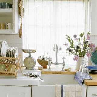
It's really not bad, but I wasn't happy with it. I also felt that I wanted to have a little more contrast in our home and with the nearly all our walls painted blue, there was hardly any contrast. When we first moved, I used these images of an 'elegant farmhouse' as my inspiration:

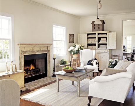
I love the blues in these rooms, especially in combination with that beautiful cream (the blue in the top right room was the inspiration for our kitchen colour). Anyway, back to the living room. After some deliberation, I decided to paint it a colour similar to the cream in the above pictures to try and better achieve this look and also to add some contrast to our home. Here are some more images I looked at when deciding whether or not I should paint our living room an off-white:

With these colours in mind, I head off to home depot to look at colour swatches. I narrowed it down right away to two Martha Stewart colours.
'Whetstone Grey'
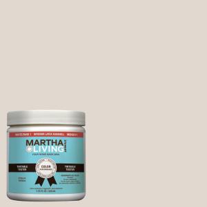
And 'Talc'

I bought a sample of each colour and brought them home to try out on our walls. After the colours dried and I saw them during the daylight and at night, I decided that the 'Whetstone Grey' would be a little too dark and I went with the 'Talc'. Next step, I prepped our walls by filling all the holes and washing all the walls. Here's the living room as I was getting ready to paint:

Before I share the after pictures, here's one more picture of the living room before I painted:

And here it is after two coats of Martha Stewart's 'Talc':

Before:

After:

Before:

After:

In the above picture you can see that I also took down the shutters in the living room and sewed a curtain for the smaller window. It really added a lot more light and openness to our living room.

The next couple photos I love because they show you the blue with the cream. I love the subtle contrast it provides- just what I wanted!


Here's a close up of the shelves above the couch. I added a couple of topiaries, a botanical print, some antique books, some glass bottles and a driftwood frame that I made. Oh, and a wreath!

This one really shows you the two colours together:


This post has been linked to the Beach Cottage blog!